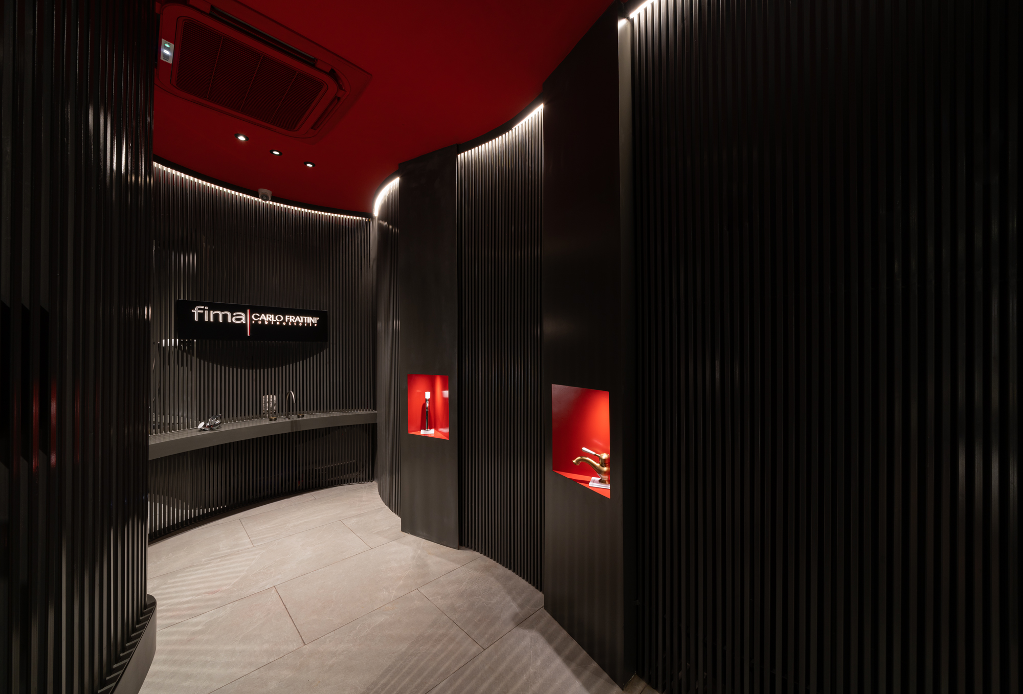
Fima is an Italian brand that has existed for three generations. The continuous search for beauty and the spasmodic attention to every detail, from the choice of machinery, to the study of the components of a new product up to the development of its explanatory brochure, is what has always distinguished and characterized the brand. This well-known company has unveiled a distinctive new showroom in Chandigarh—Premier Agencies designed by Ar. Ashwani Duggal, which is reminiscent of an art gallery.
The 330 square feet of space was designed for different concepts of faucets,
showcasing them together, but also telling a different narrative for each. The space needed a strong visual appeal, the fixtures being the focal points unveiled over an eccentric backdrop. While the primary intent was to emphasize the fixtures, it was also important to make the space harmonized with the brand’s innovative designs.
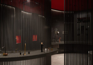
The dark grey and red hues are a part of the brand’s color story. Grey represents neutrality and balance, acting as the perfect foreground for the space. Energetic, warm, and strong, red has the power to evoke a multitude of emotions. The combination of the two helps maintain a clean, neutral look. Muted gray walls make the red accents really pop and stimulate the whole aesthetic.
The linear elements used in the screens are mild steel bars, finished with dark grey Duco paint in matt finish. The idea was to create a museum-like spatial concept, wherein the visitor experiences the expanse as an art gallery. The space is ingeniously designed with the help of screens redirecting the passage in a curvilinear form. The bars helped create interest, divided the space as per requirement, along with helping in
playing with light and shadow. While the partitions running through the showroom are individual metal bars, placed close together forming the curved divisions, the walls at the back are finished with paint in the same color as the metal bars. This was done to help the partitions stay highlighted and muted at the same time, providing a mono-colored backdrop for the same.
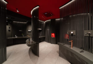
Furthermore, all the sanitary ware fixtures are highlighted with various spotlights throughout the space. The two brilliant red niches are specifically featured with distinguished faucet designs, hence are lit characteristically to make them the focal points as soon as one enters. The curvilinear partition members are accentuated with profile lights from the ceiling, arrayed along the same path as the metal bars themselves. This helped in emphasizing the partitions, as well as facilitated the play of light and shadow throughout the space.
In order to make the displays stand out, the flooring was kept coherent by finishing it with light grey tiles, and the ceiling painted with red, making it vivid yet not overpowering. In order to achieve the free-form organic interior look, metal bars were primarily used. The shelves for the faucets’ display are made in board finished in PU paint of the same grey color, providing a clean palette for the showcased fixtures.