As the new year dawns upon us, the interior design and architecture community excitedly awaits the announcement made by Pantone to introduce the color of the year-2022. Pantone is an international authority on colors, and they contribute significantly in deciding the trending tonal palette for the coming year. For 2022, the color Pantone has introduced is “Very Peri,” a confident and carefree shade that predicts an uplifting yet moody tonal palette. In order to hone in on the color, here are some insider tips and tricks by uber-luxe architecture firm Salankar Pashine and Associates to shed some light on how we can incorporate Pantone’s color of the year into our everyday lives.
Very Peri is a daring color that leaves a massive impact on its viewers while energizing the environment around it. Pallavi Pashine, the Co-Founder and Principal Architect of Salankar Pashine and Associates encourages us to go big and bold in the use of Very Peri. All experts agree that Very Peri can act as a motivational color, best suited for academic institutions. So, Salankar Pashine and Associates have gone bold with the use of this color as their primary color for the construction of the Byju’s study center in Nagpur. Balanced perfectly with tones of greys and yellow splashes, Bjyu’s smartly employs Very Peri as their primary color without it feeling overwhelming. With inspiring messages splashed all over the walls, this vivid hue seems to be the best possible choice for an educational institution, such as Byju’s.
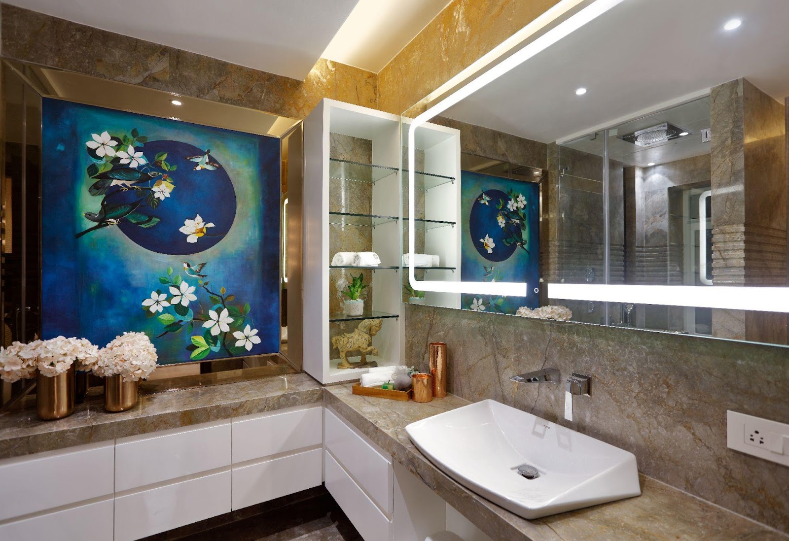
In another one of their projects, Luxe Villa, Salankar Pashine and Associates have uplifted the entire bathroom with a stunning mural. However, instead of going for a purple base for the mural, the design team has opted for a punchy blue that imparts the same playfulness as the purple-based Very Peri with a more regal royal blue that seems to balance out the neutral tones in the bathroom. As the bathroom is where folks can get some reprieve from the humdrum of urban and corporate lives, this mural with gorgeous flowers and a bird seems to be the perfect match for the bathroom as it is reminiscent of nature. By using a rich color such as royal blue, there is a certain gravitas linked to the mural, as it serves to uplift the bathroom’s interiors while expanding the feeling of spaciousness in the bath. The mural, along with brass finishings and white flowers, make the bathroom the ultimate relaxation space.
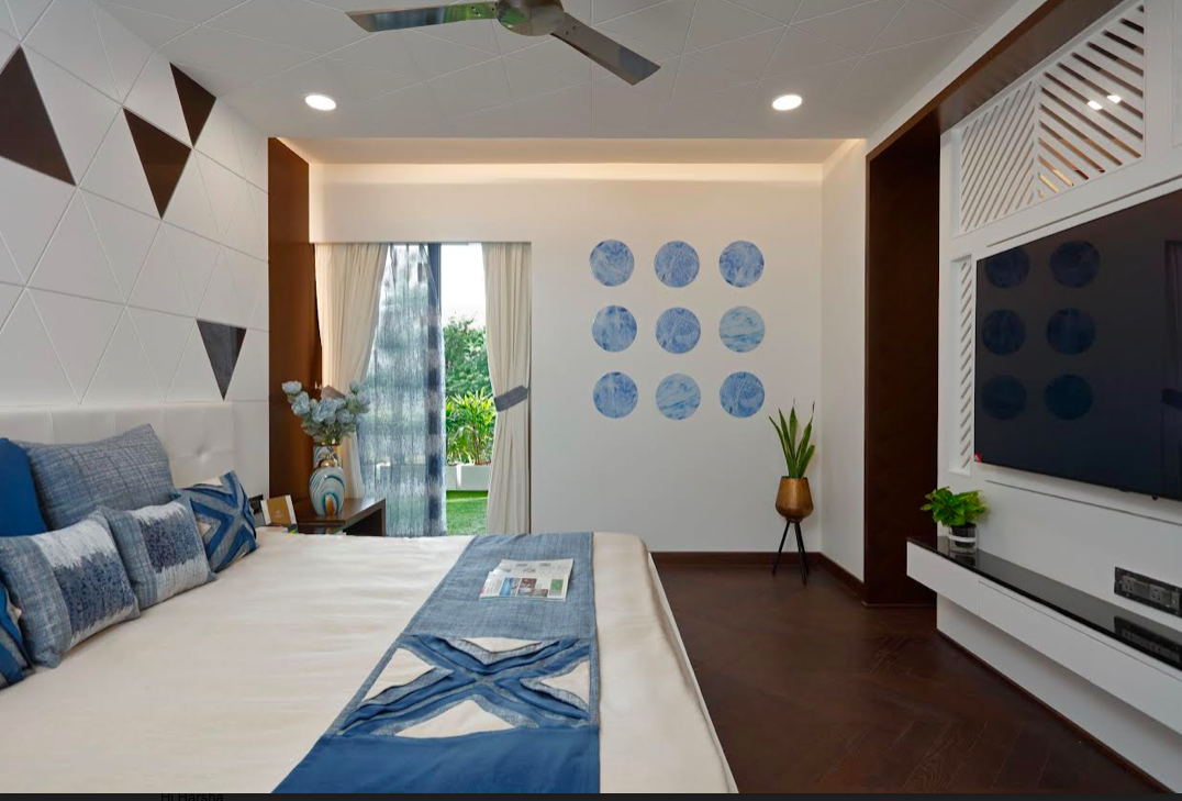
Accent walls are a simple but impactful way to incorporate heavy colors in front of a neutral background. The home designed for the founders of the firm has various forms of beautiful accent walls without taking away the natural beauty of the house. However, instead of using a bright purple as a background for a stunning mural-based accent wall, they have opted for the recreation of Buddha on a soft jade green-based background that seems to exude timeless charm. Supporting colors in the hues of blue or beige have been incorporated to make a significant impact on the viewer. Additional lotus flowers in red and yellow dot the mural, creating a mural fit for a magazine spread. A rendition of pastel blue has been used for the mural, leading to smart use of the color, without it being too overwhelming in nature.
Pantone’s color of the year inspires creativity and innovation while being the perfect shade to introduce the interplay of various other colors that exist in harmony with each other.